
The evolution of my website
Tue Feb 13, Daniel Báez
Since I started in the world of programming, I worked in the niche of web video games, but really I was also a web programmer, I had studied HTML and CSS on my own, so at a certain point I decided to make an original website from scratch. It was a “retro” site according to me, not that I didn’t know how to make a more complex UI, but I wanted to show the information without too many detours and with responsive design.
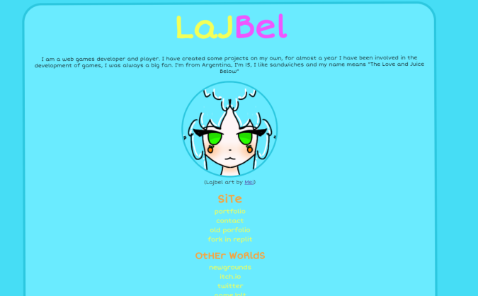
This is what my first website looked like. That light blue was horrible, and the contrast was probably -15, but at the time I didn’t give it much importance, since what I was interested in was that the right links were there. Eventually I decided to give it a redesign:
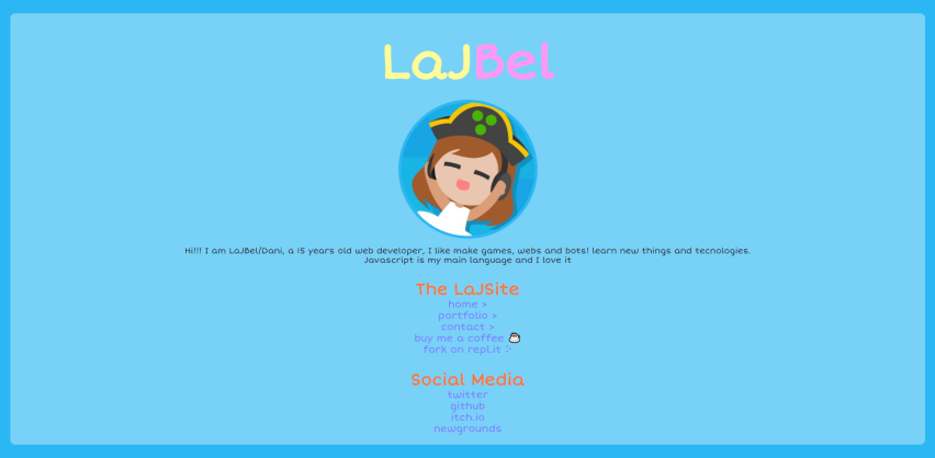
Here we can see an evolution of the same website, some better colors, we still had the navigation in a list of links, but it looked better, I remember a friend told me that making this website was too basic and easy. I never really changed it, I didn’t care much about it.
But I got tired of it, I wanted to have a website up to par, something that made a little more sense, fuck me, I’m supposed to be a web developer, how could I have such a low level? So I decided to start mocking up an idea.
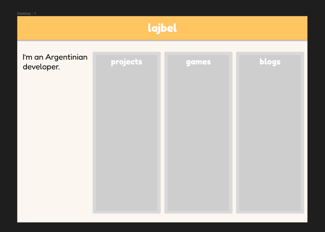
At that time I was just starting to use Trello, so I thought it would be cool to organize things this way, okay, yes, the images were extremely bizarre, I was supposed to change them. Then I decided to incorporate orange as the color of the page, at least in the mock-ups it looked good.
Then I started to use a more round style, thinking well, this is what I usually use, it fits with my font, and well, I like it.
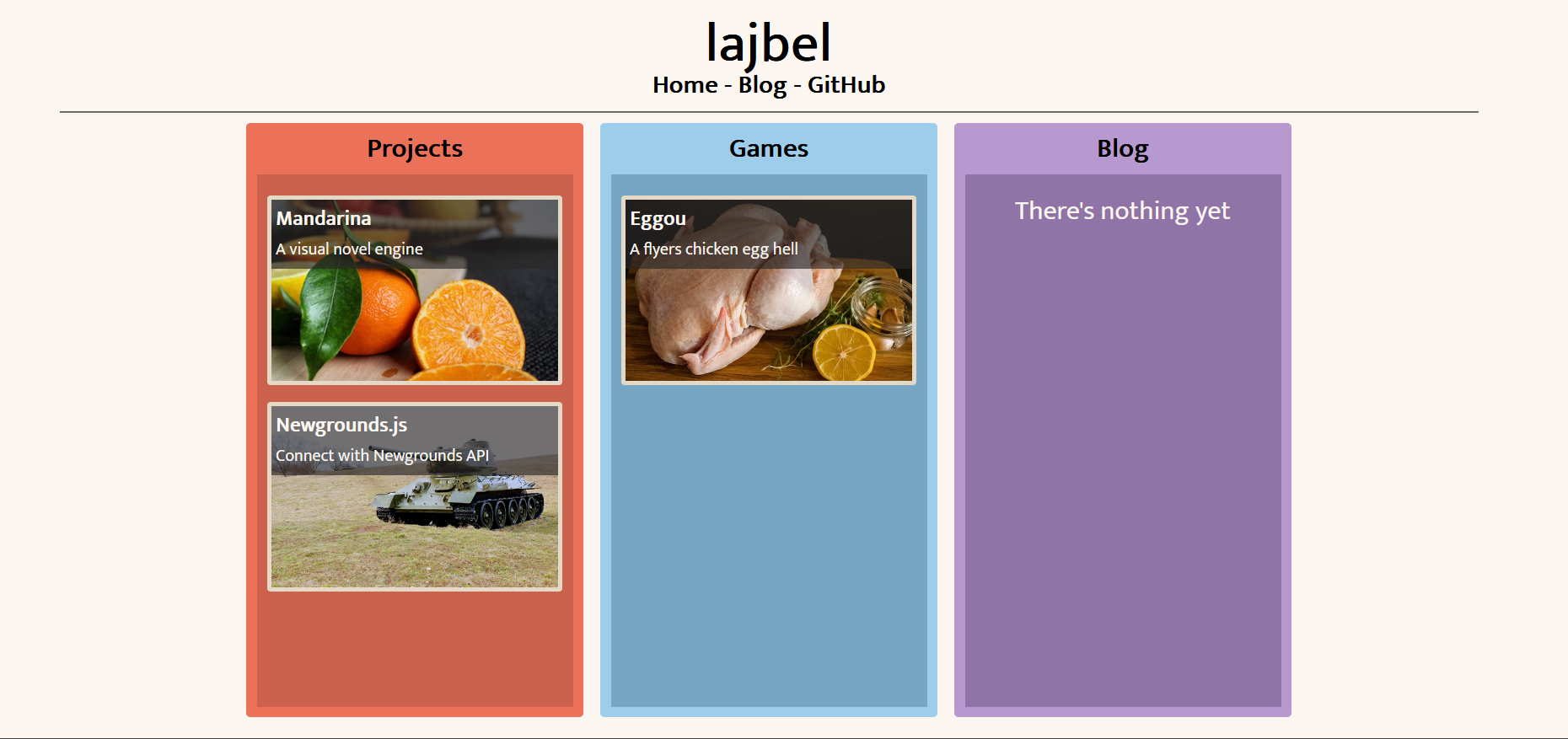
I coded up the design using the framework Lume to generate static websites, and what were the boards ended up becoming a sidebar, and well, the result was the following:
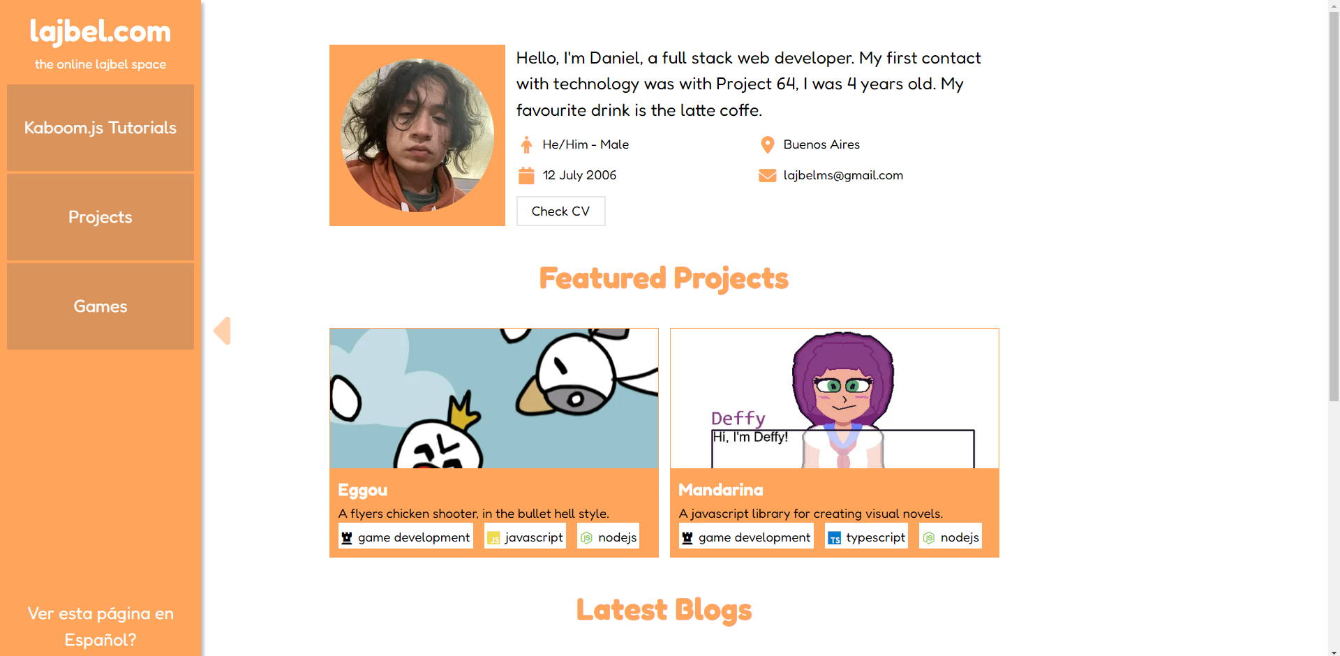
It was missing things, a section to see all the projects, I didn’t really like my profile section, and I felt it was too basic. Also, there had been problems with scalability and code, so I decided to completely change the design.
So, first I decided to anchor myself to a design system, and well, I went for TailwindCSS along with the DaisyUI component library. I also decided to read the book by the creators of Tailwind, Refactoring UI. This gave me a lot of information on how to make good designs, and since the frameworks themselves are prefabricated so that you have to be stupid to make bad designs with them, I ended up with this:
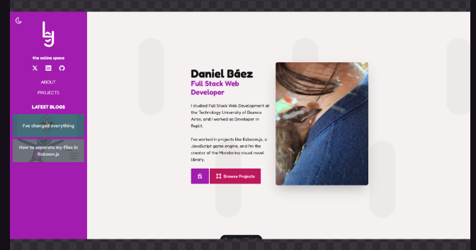
I changed the colors, being the main color purple, a much easier color to combine in general. I also decided to change the description, finally add a section for projects, career and some nice buttons, using Iconify icons. I’m satisfied, I feel I got a good website, and it’s also extensible, something that the previous one lacked.
